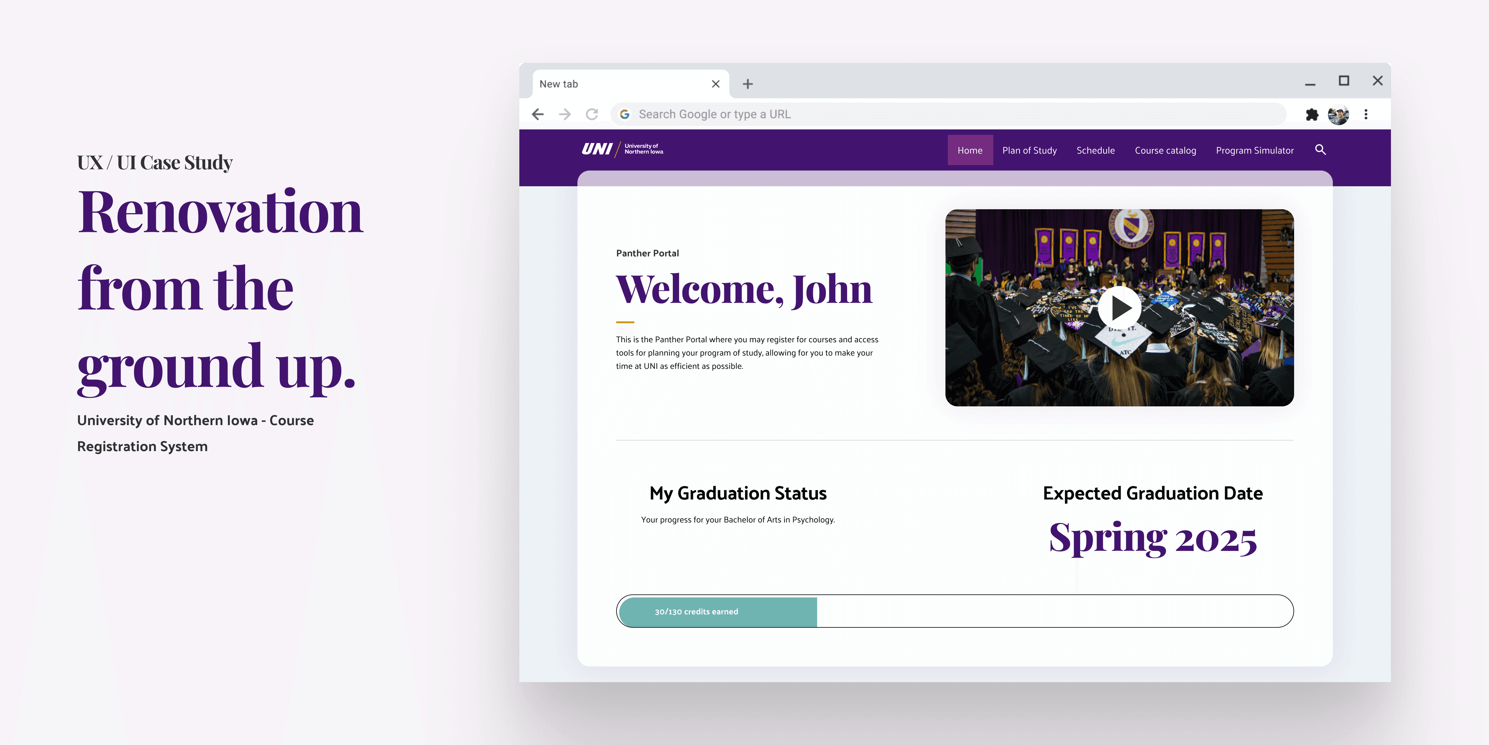
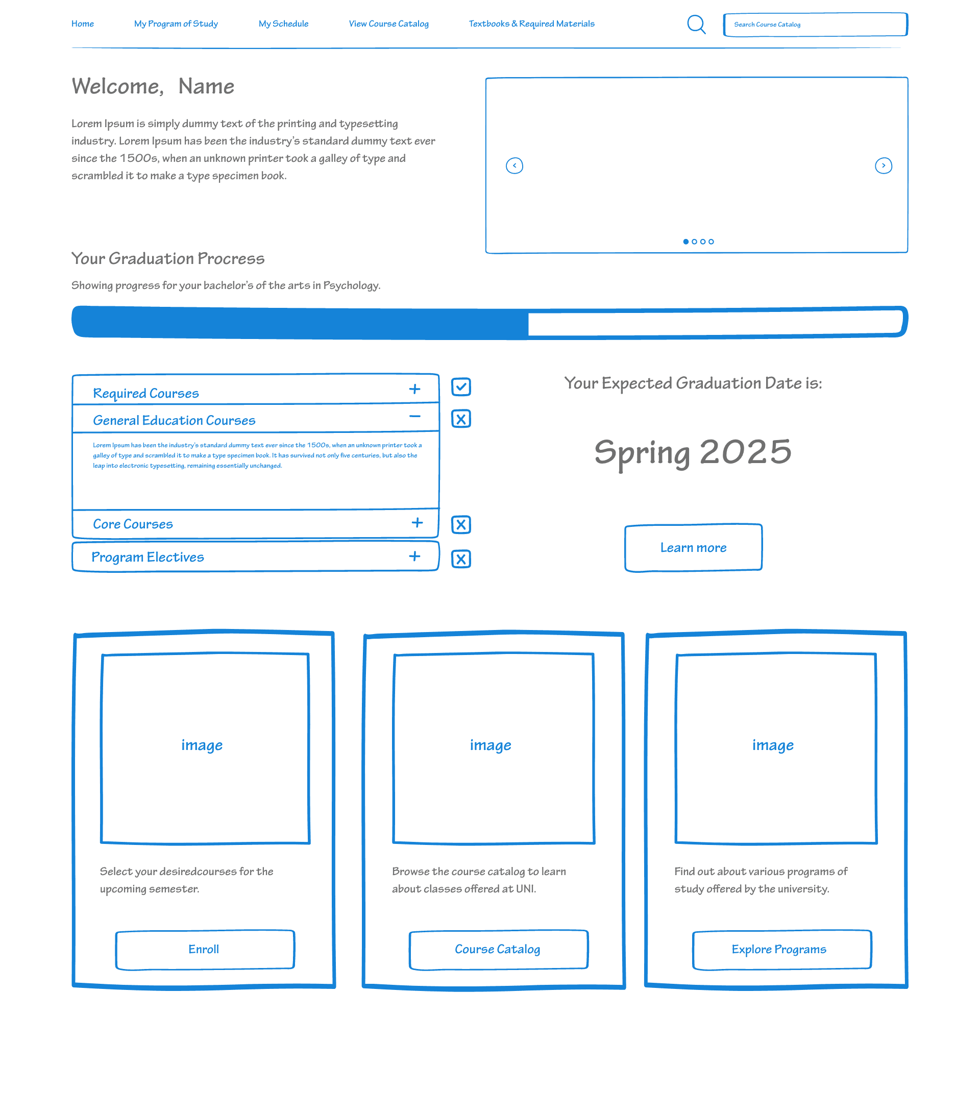
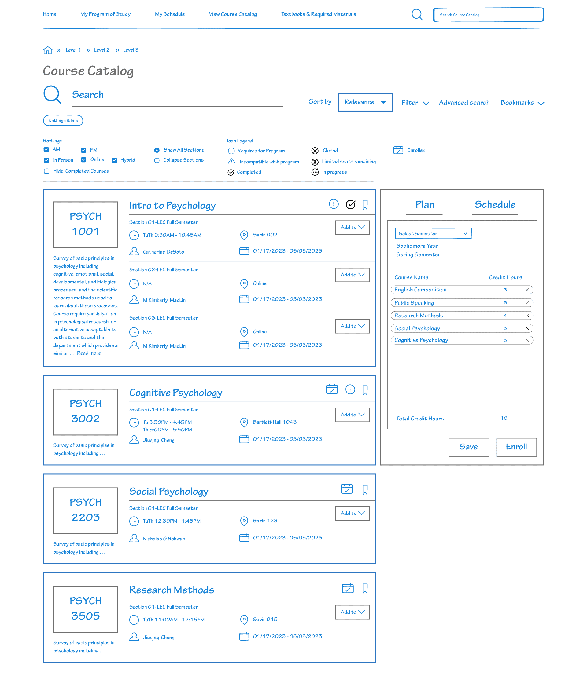
Plan
Our design allows for students to plan out their plan of study following the template for their major to quickly build their schedule for every semester they plan to attend classes, allowing them to even add back-up courses should things go unexpectedly.
Register
When time for registering comes they can enroll with a click of a button checking for any discrepancies before setting schedules in stone.
Simulate
Students thinking about changing majors or adding additional programs can experiment with a simulator which helps students construct a plan of their studies while prioritizing courses that overlap between programs.
Challenges
Constraints Everywhere
Tight Budget
Problem: Resource limitations hindered system enhancement due to lack of available resources.
Solution: Simplified coding approach to ensure cost-effectiveness while providing essential benefits.
Approach: Segmented features into three user-friendly categories: past, present, and future, shaping planning, enrollment, and simulation features
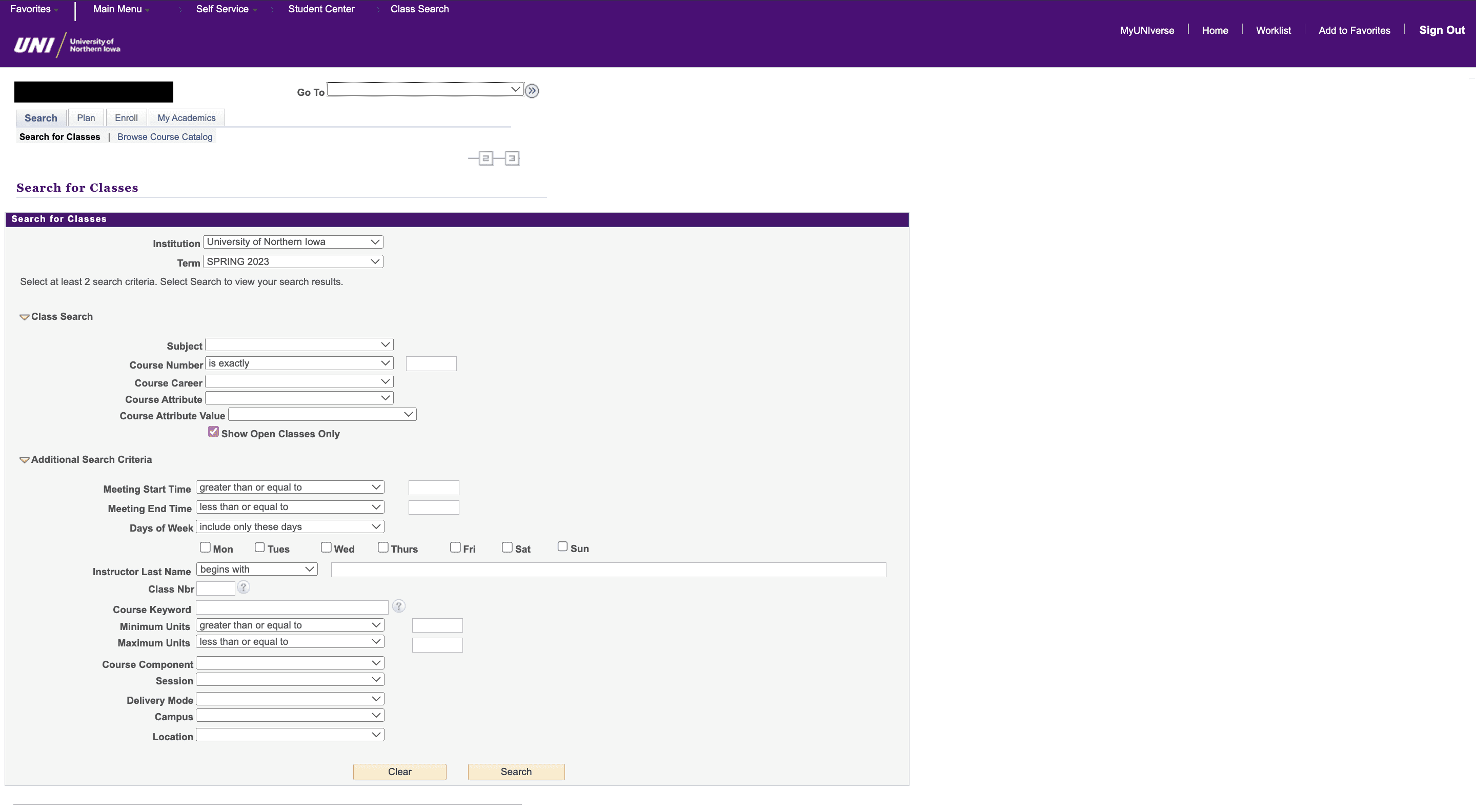
Poor Design & Usability
Problem: Previous system had UX issues, lacked clarity, and failed to prevent errors.
Solution: Revamped the interface, employing modern design principles for hierarchy and clarity.
Approach: Transformed visuals for an intuitive, organized appearance, improving overall usability.
Need for UX Optimization
Challenge: Existing system garnered negative feedback, with overlooked features and confusion. Users were often unaware of available features due to obscurities.
Solution: Identified functional and design issues, prioritizing visibility enhancements.
Approach: Retained valuable features, increasing their prominence to benefit users.
Frustrations
Demographics (visual learning should be Faculty)

Wants/Wishes

Learning Preferences/ how they learned to use the system

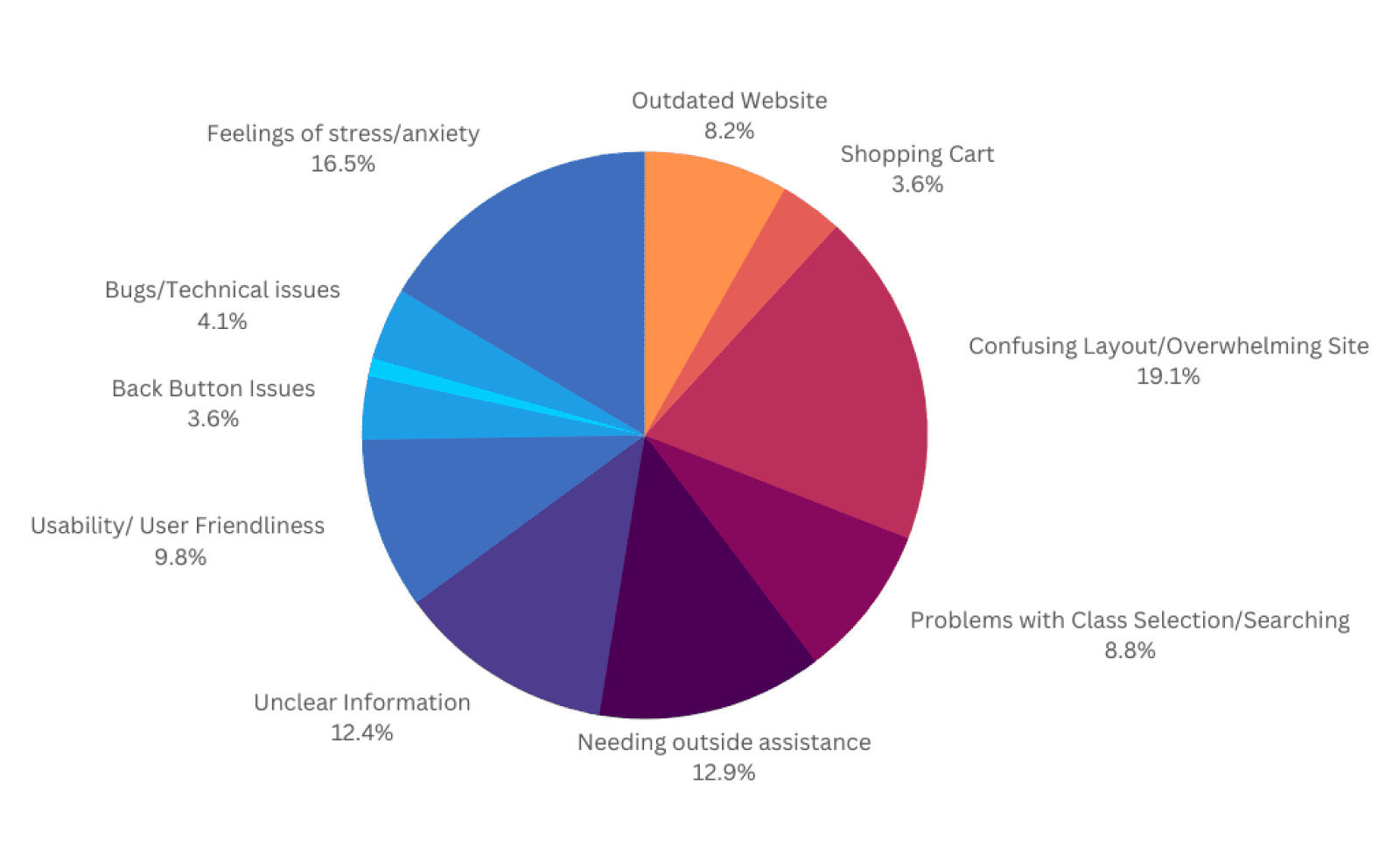
Research
Data Collection & Insights – Damn, they're really not happy.
Pictured above is a portion of our research. We lacked ways to collect data on the previous registration data so we used qualitative data and thematic analysis to identify patterns within. In total we collected 72 interviews from students and faculty about their experiences regarding registering with courses.
46% students going to advisors or other students for help.
The vast majority of users desire a more easy to use system.
Empathy & Journey Mapping
A Rollercoaster of Emotions
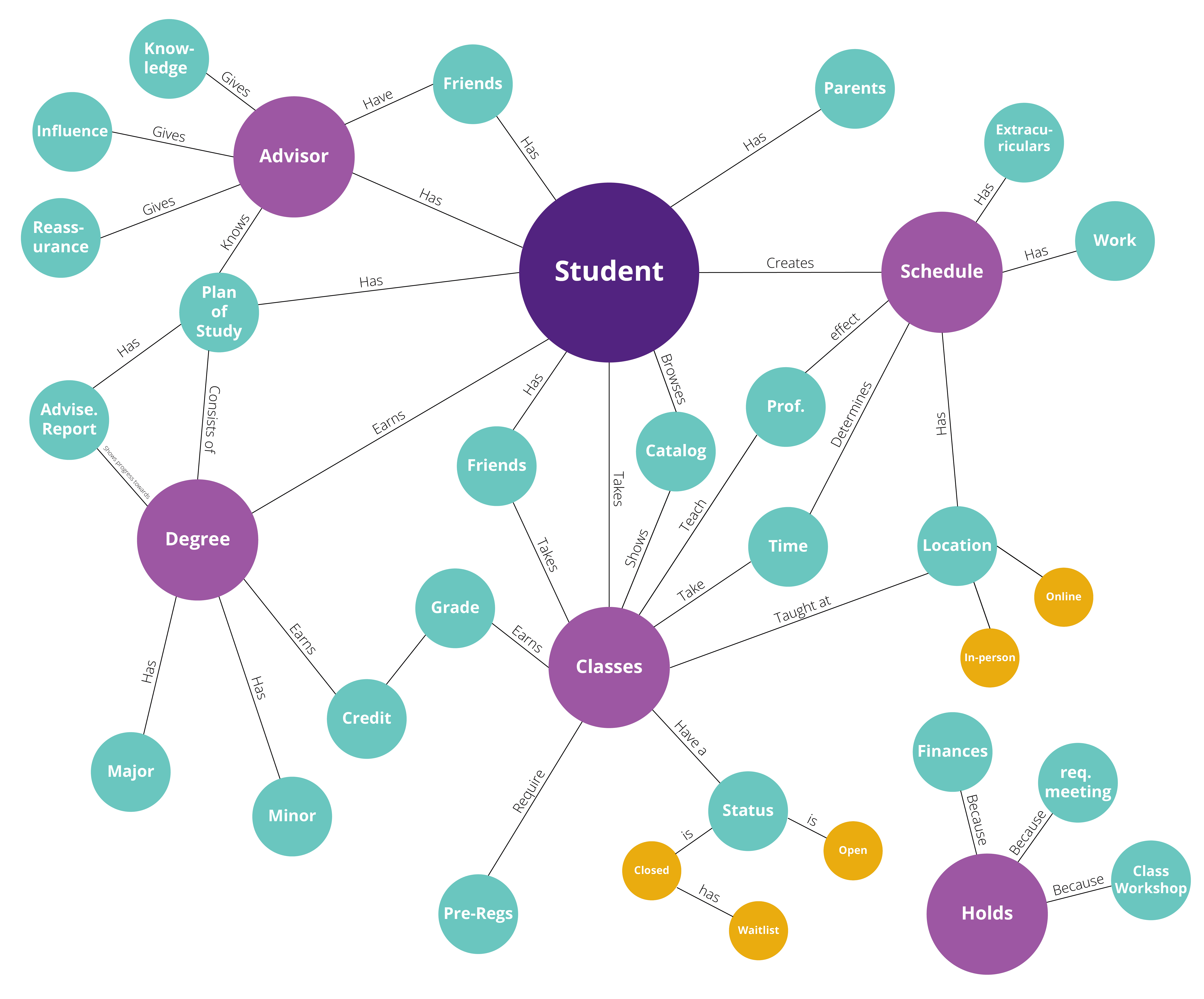
Mental Model
A web encapsulating the inner world of an average college student at UNI broken down by priority in order to better understand the user.

Journey map
A chart and graph detailing the student's thoughts and feelings as they endure the process of course registration. Notably, the experience for the previous system was aggravating.

Personas
Identifying three archetypes of students.
From previous exercised, patterns in students that revealed crucial characteristics for the registration process when using the old system wer identified. These three personas helped come up with my hypothesis for the past, present, and future idea.
Students who are avid planners who value organization and making the right choices (as shown by Amanda).
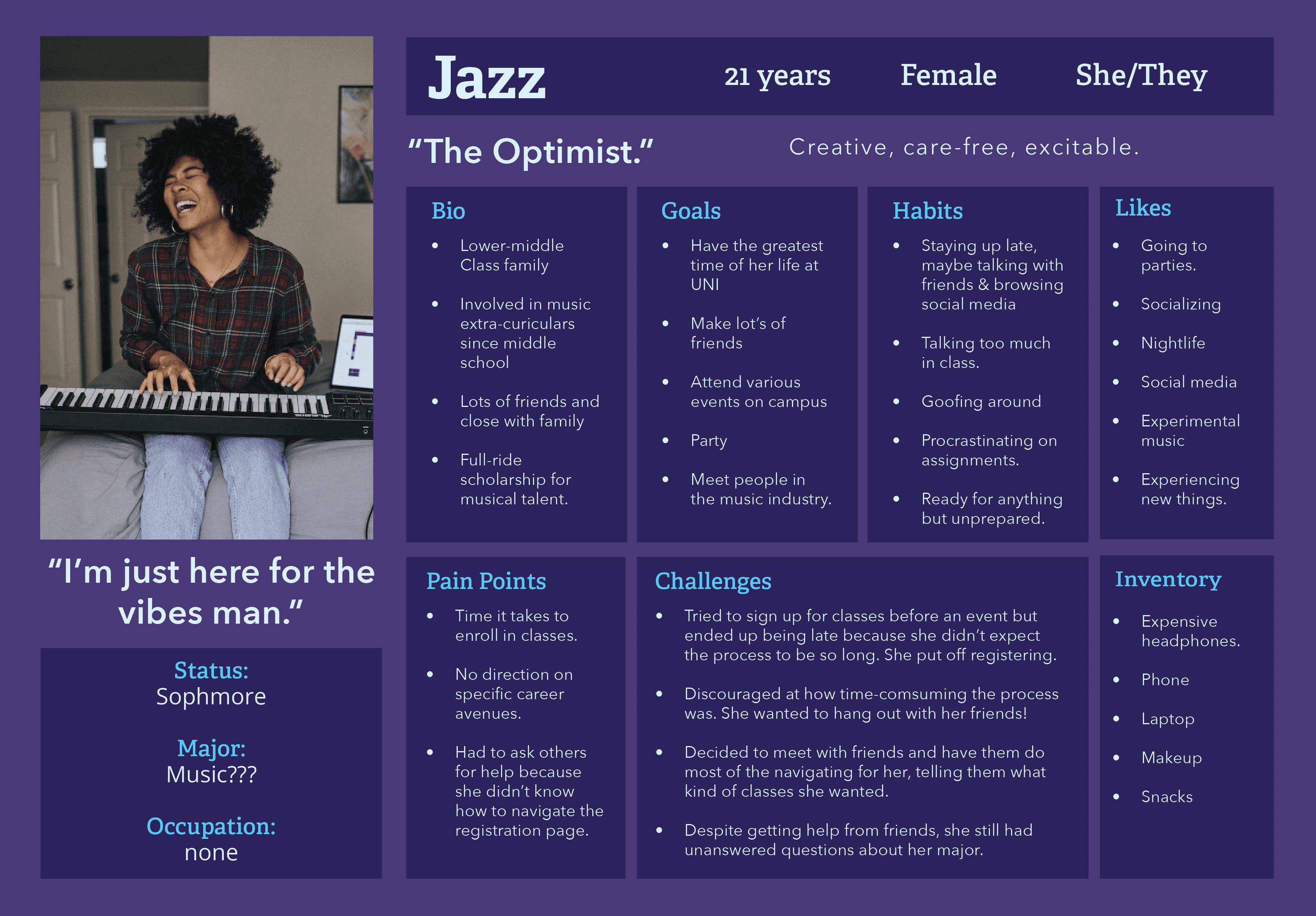
Students who have their priorities in other places but are blindsided by the high demand of the registration system (as shown by Jazz).
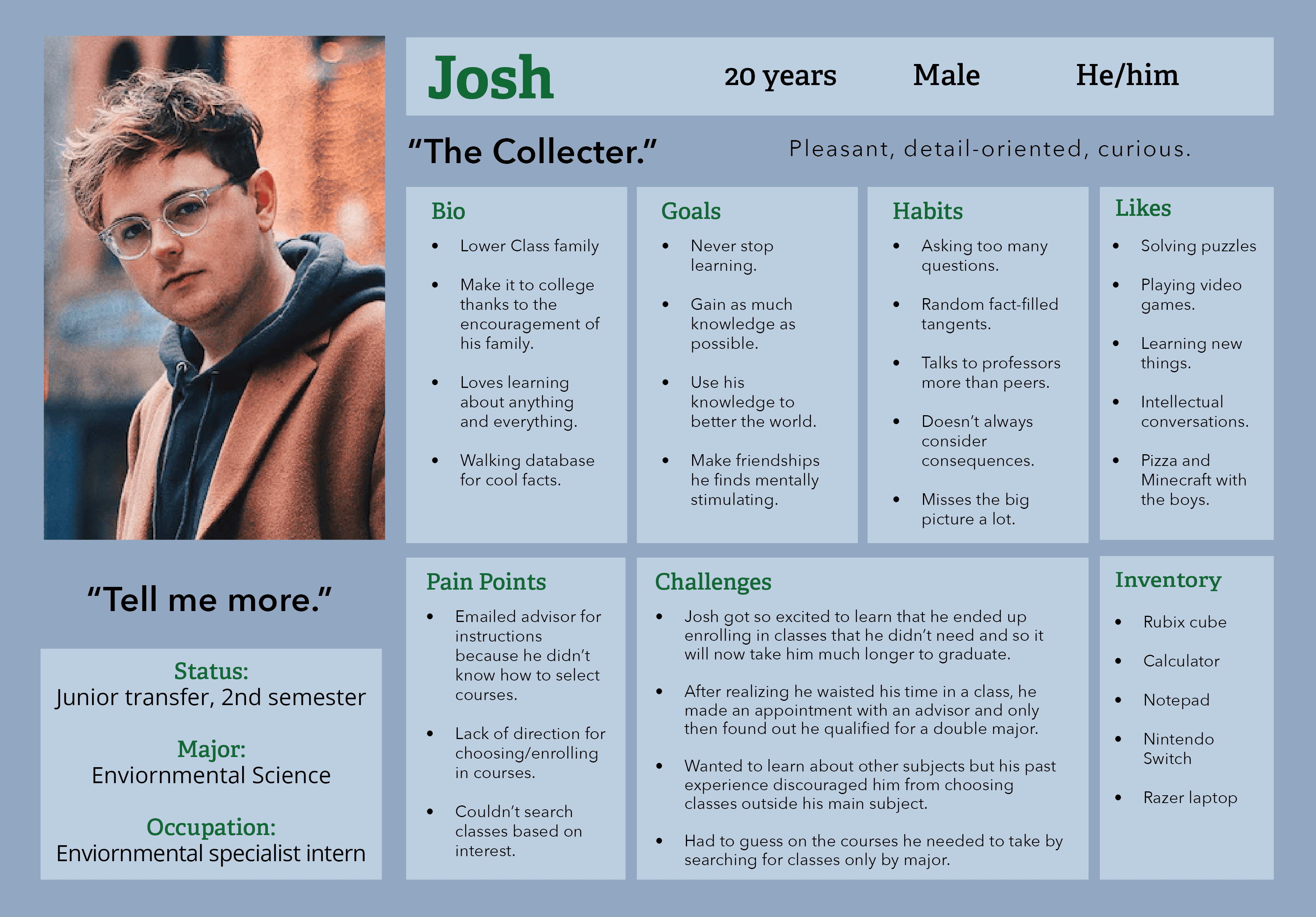
Represents victims of the course registration system who have wasted time in college due to human error and missed opportunities (as shown by Josh).
Probably the Most important realization
Upholding loyalty to brand mission.
UNI strives to be a university of varying professional programs that outputs leaders with quality education, but throughout this project my designers and I came to notice the opposite. Yes, the programs are great, but why is signing up for them so neglected? What's the point of great problems if you can't sign up for them? Why do their own employees get stuck fixing their problems?
The answer my team discovered came down to allocation of money. We knew our design would have to be simplistic and easy on developers to save costs.
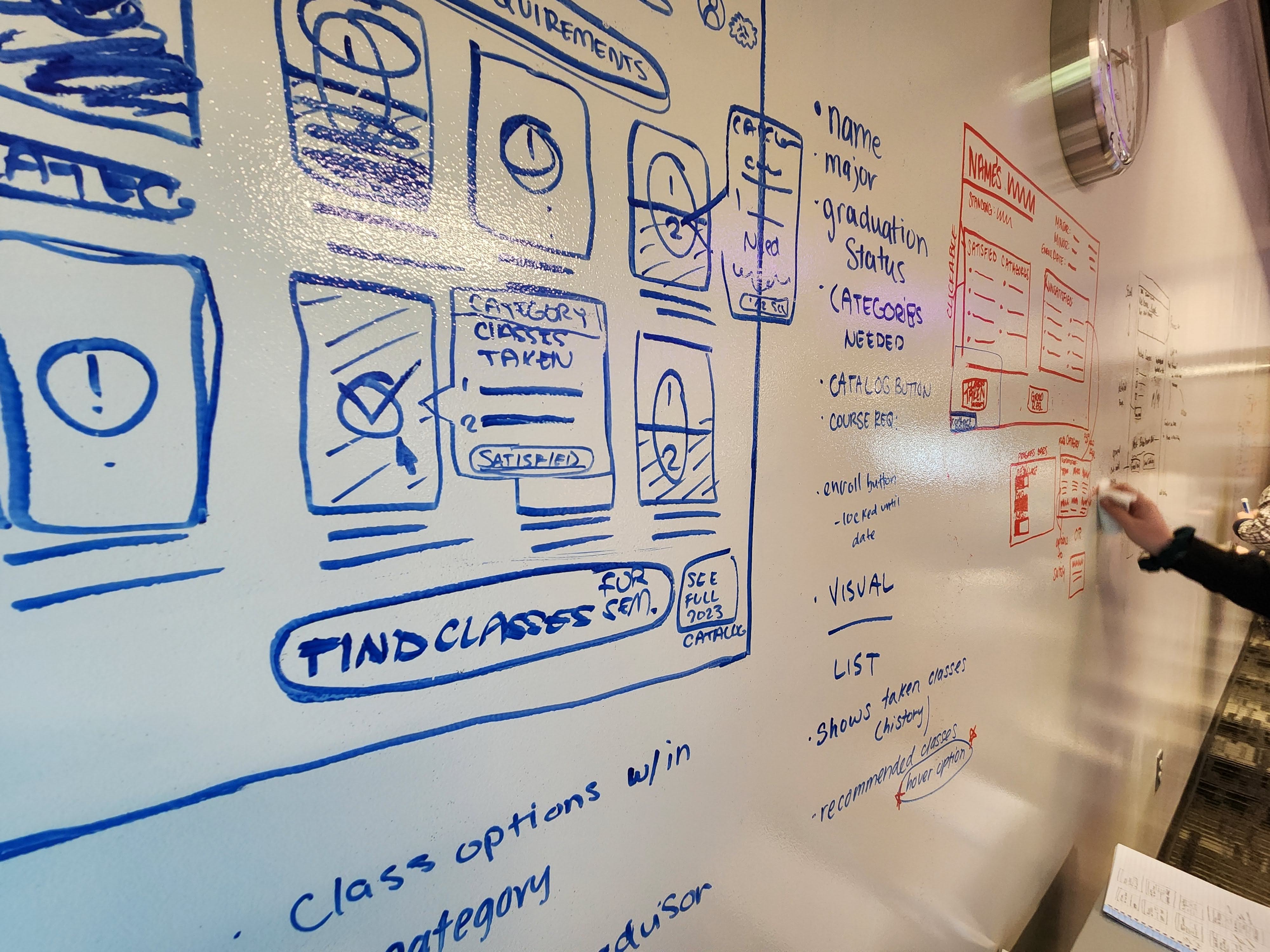
Ideation + Low Fi Prototype
Slimming things down.
Once we had our idea down to organize the system into a few main features building the prototype went smoothly. I held presented the wireframes to the research team and we gathered the features could be simplified down more.
The biggest differences that the textbooks section was to be moved under course schedules and introductory guide would be scrapped due to aiming the design to highly intuitive.
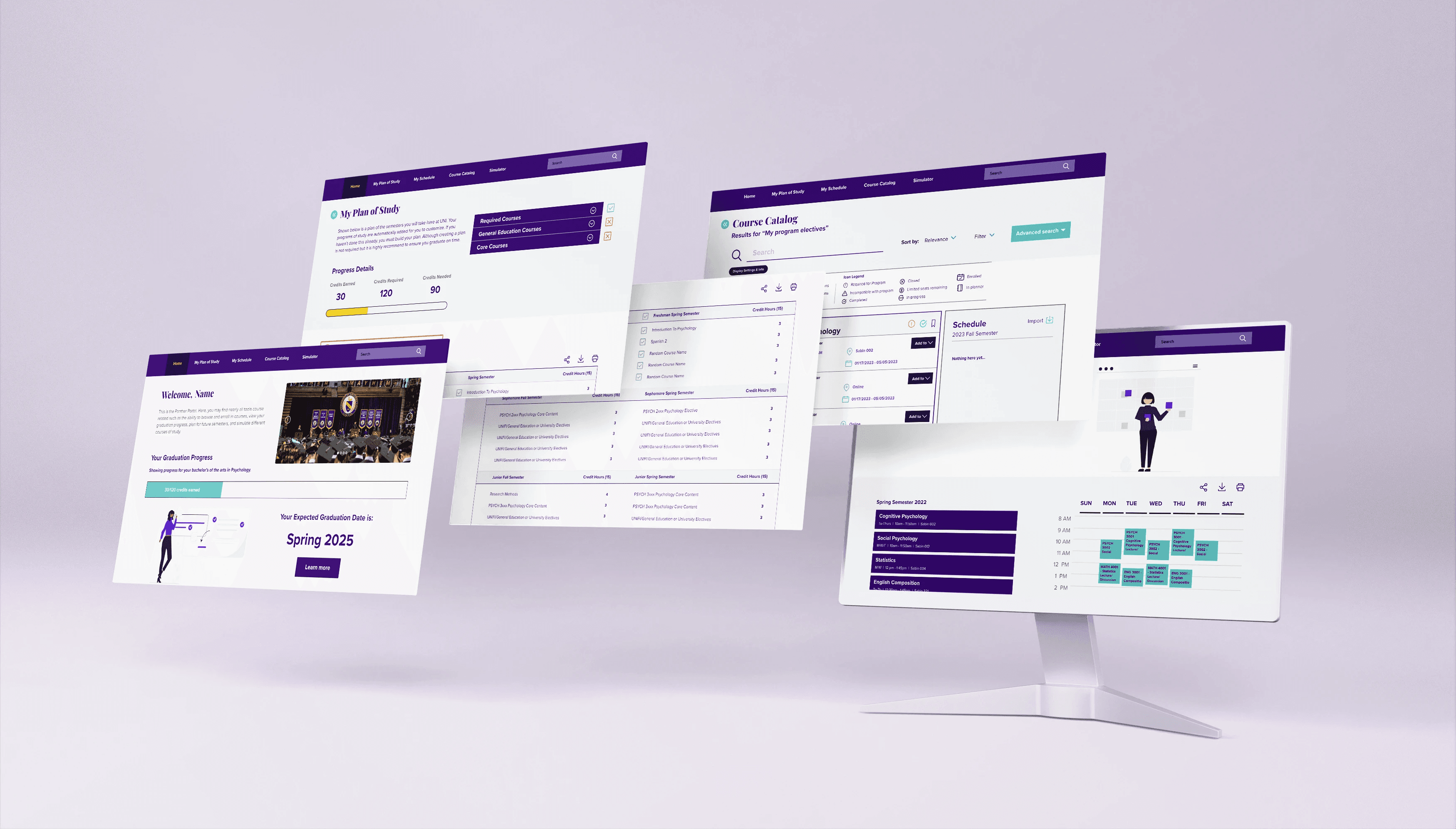

Testing & Final Design
Promising Results
User testing for the new system was an overall success. Though time was not the only concern, we were surprised that testers could complete the enrollment process in as little as three minutes.
All testers voluntarily said they preferred the new system much more.
Minor changes such as cosmetic ones were made following testing. Including a concept for another visual overhaul. Faculty who attended the presentation were satisfied with the product and the project ended on great terms.

Accomplishments
Saving $85K every year.
Because this new design saves a large chunk of time, faculty advisors can now accomplish their work without the need for multiple student aids.
Students have also freed time from the previous full day's attention to just an hour at most!


